In the previous article, we have converted the probe ID into a gene symbol.
Obtaining Group Information — group_list
Group information indicates which samples belong to the control group and which belong to the tumor group.
Use the pData function to obtain the group information — group_list:
pd <- pData(eSet[[1]])
The pData() function retrieves the annotation information for each sample. Typically, the first column (the “title” column) describes which samples are controls and which are treatments.
According to the information described in the first column, we manually create the group information group_list:
Method 1: Using the stringr package
					CopyEdit
library(stringr)
group_list = ifelse(str_detect(pd$title, "Control") == TRUE, "control", "treat")
group_list
The stringr package is used for string processing. The function str_detect belongs to this package and is used to determine whether a character vector matches a specific pattern. It returns a logical vector with the same length as the input:
					r
CopyEdit
> str_detect(pd$title, "Control")
[1]  TRUE  TRUE  TRUE FALSE FALSE FALSE
Here, the input vector is the first column of the data frame pd, namely pd$title, which consists of six character elements. The str_detect() function automatically checks whether the pattern "Control" is present in each element of the pd$title vector. It returns TRUE if the pattern is found, and FALSE otherwise.
After obtaining the logical vector with str_detect(), we use ifelse() to generate the required group information group_list:
					r
CopyEdit
> group_list
[1] "control" "control" "control" "treat"   "treat"   "treat"
Method 2: Manually Define the Group Information
Since we already know that the first three samples are controls and the last three are treatments, we can manually create a group list as follows:
					r
CopyEdit
group_list = c(rep("control", times = 3), rep("treat", times = 3))
group_list
Note: I personally recommend Method 2 — if a simple approach works, there is no need to complicate the process.
3. Check the Expression Matrix
The expression matrix describes the expression levels of each gene across different samples. With the expression matrix, we can proceed with downstream analyses. The first step is to verify whether the expression matrix we obtained is correct.
Approaches for validation include:
Checking the expression levels of housekeeping genes
Assessing differences between groups: PCA plots, heatmaps, hierarchical clustering (hclust) plots, etc.
3.1 Validate Expression of Common Housekeeping Genes
We start by examining the expression levels of typical housekeeping genes (e.g., GAPDH and ACTB). If their expression levels are relatively high and consistent, it suggests that our data quality is acceptable.
At this point, the row names of the expression matrix exp have already been converted from probe IDs to gene names. Thus, we can extract the expression values of a specific gene across all samples using:
					r
2
CopyEdit
3
exp['GAPDH',]
Example output:
					r
CopyEdit
GSM1052615 GSM1052616 GSM1052617 GSM1052618 GSM1052619 GSM1052620
   14.3187    14.3622    14.3638    14.4085    14.3569    14.3229
Similarly, for ACTB:
					r
CopyEdit
exp['ACTB',]
Example output:
					r
CopyEdit
GSM1052615 GSM1052616 GSM1052617 GSM1052618 GSM1052619 GSM1052620
   13.8811    13.9002    13.8822    13.7773    13.6732    13.5363
From these results, we can see that both housekeeping genes show relatively high expression levels, which is consistent with expectations.
How do we know these values are high? We can visualize the overall expression levels across all samples by plotting a boxplot of the expression matrix:
					r
CopyEdit
boxplot(exp)
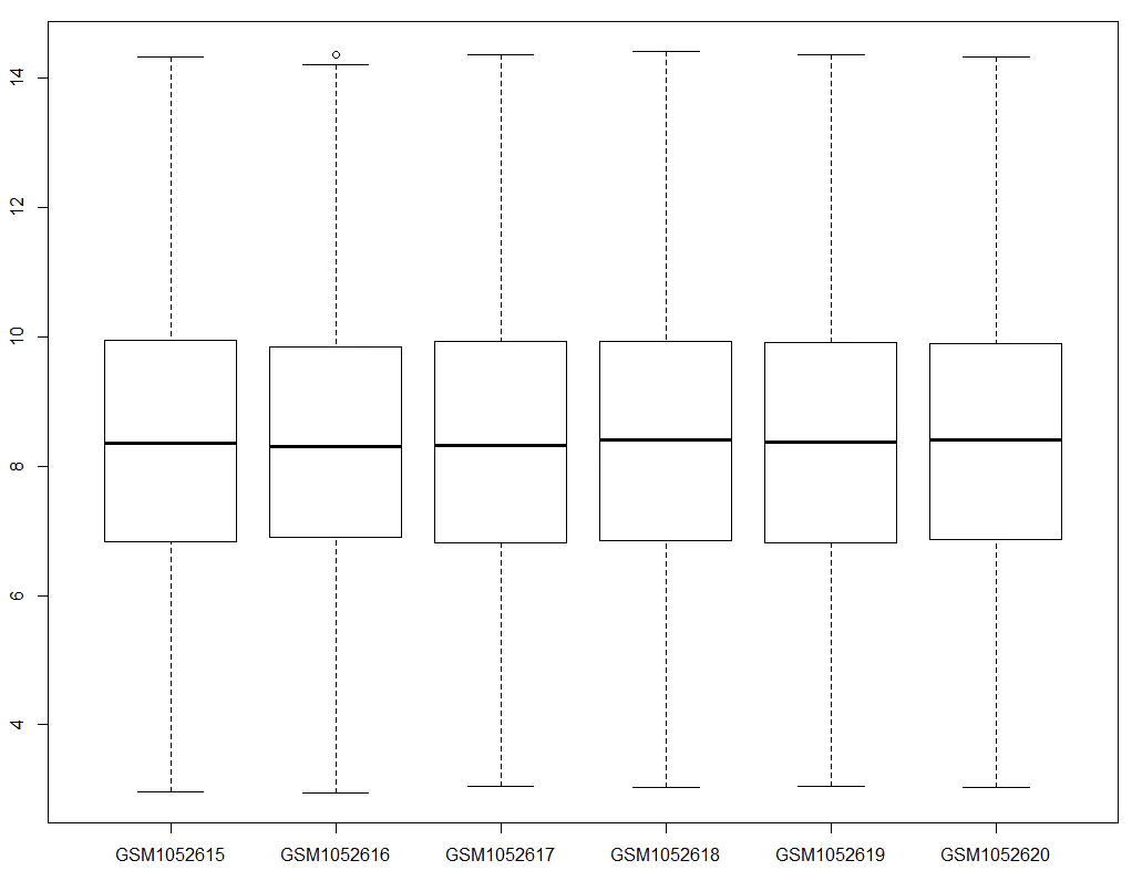
We observe that most genes have expression values around 8–9, whereas GAPDH and ACTB are around 13–14, indicating higher expression levels as expected. If we find that the expression levels of housekeeping genes are abnormally low, it suggests a possible issue during the expression matrix extraction process — such as errors during ID conversion.
3.2 Visualizing the Distribution of Expression Values — Boxplot for Each Sample
We can visualize the expression levels of all samples by drawing a boxplot using ggplot2.
Step 1: Prepare the data (exp_L) for plotting
					r
CopyEdit
library(reshape2)
head(exp)
exp_L = melt(exp)
head(exp_L)
colnames(exp_L) = c('symbol', 'sample', 'value')
head(exp_L)
Step 2: Obtain group information and add it to exp_L
					r
CopyEdit
library(stringr)
group_list = ifelse(str_detect(pd$title, "Control") == TRUE, "control", "treat")
group_list
exp_L$group = rep(group_list, each = nrow(exp))
head(exp_L)
Step 3: Create the boxplot using ggplot2
					r
CopyEdit
library(ggplot2)
p = ggplot(exp_L, aes(x = sample, y = value, fill = group)) + geom_boxplot()
print(p)
Enhanced version of the boxplot:
					r
CopyEdit
p = ggplot(exp_L, aes(x = sample, y = value, fill = group)) + geom_boxplot()
p = p + stat_summary(fun.y = "mean", geom = "point", shape = 23, size = 3, fill = "red")
p = p + theme_set(theme_bw(base_size = 20))
p = p + theme(text = element_text(face = 'bold'),
              axis.text.x = element_text(angle = 30, hjust = 1),
              axis.title = element_blank())
print(p)
Although the plotting code looks complex, the overall logic can be broken down as:
Prepare the data (
exp_L) → Add group information → Useggplot2for visualization
Understanding the exp_L Data Structure
Let’s examine the structure of exp_L:
					r
CopyEdit
> head(exp_L)
     symbol     sample   value   group
1 LINC01128 GSM1052615 8.75126 control
2    SAMD11 GSM1052615 8.39069 control
3    KLHL17 GSM1052615 8.20228 control
4   PLEKHN1 GSM1052615 8.41004 control
5     ISG15 GSM1052615 7.72204 control
6      AGRN GSM1052615 9.19237 control
Sample counts per sample ID:
					r
CopyEdit
> table(exp_L[,2])
GSM1052615 GSM1052616 GSM1052617 GSM1052618 GSM1052619 GSM1052620
     18834      18834      18834      18834      18834      18834
Dimensions of exp_L:
					r
CopyEdit
> dim(exp_L)
[1] 113004      4
Calculation:
					r
CopyEdit
> 18834 * 6
[1] 113004
From these outputs, we can conclude:
Each gene (18,834 genes) has a corresponding expression value for each sample (6 samples).
Thus,
exp_Lcontains 113,004 rows and 4 columns (gene symbol, sample ID, expression value, group).
Here, we only use the data melting (melt) function from the reshape2 package.
Melting a dataset means restructuring it into a long format, where each measurement (i.e., the expression value of a gene in a sample) occupies one row. Each row must include identifier variables — in our case, the gene symbol and sample ID — that uniquely define each measurement. The actual measurement variable (expression value) will be automatically created during the melting process.
In simpler terms: Originally, in the exp matrix, one row represented the expression values of a gene across six samples. After melting, each individual expression value occupies one row, and two identifiers — the gene symbol and the sample ID — are needed to specify exactly which sample and which gene the expression value belongs to.
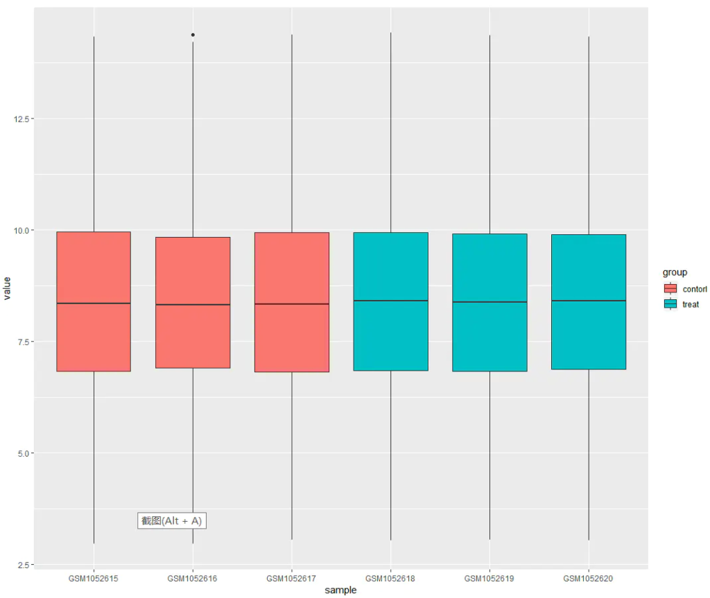
From the boxplot, we can observe that the two groups — control and treat — generally align along the same level. This indicates that the dataset is suitable for downstream comparative analysis.
If the groups do not align well (i.e., clear offsets between groups), this suggests the presence of a batch effect. In such cases, we can apply normalization using the normalizeBetweenArrays function from the limma package:
					r
CopyEdit
library(limma)
exp = normalizeBetweenArrays(exp)
Additional Visualization Options for Expression Distribution
Besides boxplots, ggplot2 offers other types of plots to visualize the expression distribution across samples. All of these plots aim to check the same underlying question: whether expression distributions across samples are comparable. You can choose the plotting method according to your preference.
Examples:
Violin plot:
					r
CopyEdit
p = ggplot(exp_L, aes(x = sample, y = value, fill = group)) + geom_violin()
print(p)
Histogram for each sample:
					r
CopyEdit
p = ggplot(exp_L, aes(value, fill = group)) +
    geom_histogram(bins = 200) +
    facet_wrap(~sample, nrow = 4)
print(p)
Density plot for each sample:
					r
CopyEdit
p = ggplot(exp_L, aes(value, col = group)) +
    geom_density() +
    facet_wrap(~sample, nrow = 4)
print(p)
Overall density plot:
					r
CopyEdit
p = ggplot(exp_L, aes(value, col = group)) +
    geom_density()
print(p)
3.3 Checking Group Information
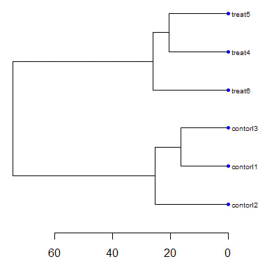
Another important step is to check whether the groupings of samples are reasonable, typically by using PCA plots and hierarchical clustering (hclust) plots.
Here, we first perform hierarchical clustering.
Step 1: Update the column names of the expression matrix
					r
CopyEdit
head(exp)
colnames(exp) = paste(group_list, 1:6, sep = '')
head(exp)
Step 2: Define node parameters for better visualization
					r
CopyEdit
nodePar <- list(lab.cex = 0.6, pch = c(NA, 19),
                cex = 0.7, col = "blue")
Step 3: Perform hierarchical clustering
					r
CopyEdit
hc = hclust(dist(t(exp)))
Step 4: Plot the dendrogram
					r
CopyEdit
par(mar = c(5, 5, 5, 10))
plot(as.dendrogram(hc), nodePar = nodePar, horiz = TRUE)
After plotting the dendrogram, we observe that the control and treatment groups are well separated, and samples within each group are tightly clustered together.
This indicates that the data quality is acceptable for downstream analysis.
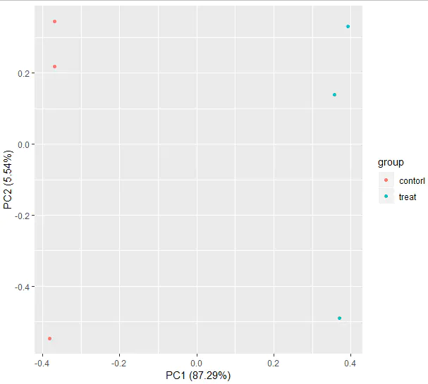
Principal Component Analysis (PCA)
We can further assess sample distribution by performing PCA analysis.
					r
CopyEdit
library(ggfortify)

# Transpose the expression matrix and convert it into a data frame
df = as.data.frame(t(exp))

# Check dimensions (do not attempt to view the entire dataframe if it is large, as it may cause RStudio to freeze)
dim(df)
dim(exp)

# Preview part of the data
exp[1:6, 1:6]
df[1:6, 1:6]

# Add group information
df$group = group_list

# Perform PCA and plot
autoplot(prcomp(df[, 1:(ncol(df) - 1)]), data = df, colour = 'group')

# Save the processed data
save(exp, group_list, file = "step2output.Rdata")
After generating the PCA plot, we again observe that samples from the control and treatment groups are clearly separated, and samples within each group cluster tightly together.
This further confirms that the data quality is good and meets the expectations for subsequent analyses.
4. Differential Expression Analysis and Visualization
For microarray data, the most commonly used package for differential expression analysis is limma. To use limma, three datasets are required:
The expression matrix (
exp)The design matrix (
design)The contrast matrix (
contrast.matrix)
Below, we will prepare these three input datasets:
The expression matrix (
exp) has already been generated, so no additional work is needed.We have also obtained the group information vector (
group_list), which will be used to create the design matrix.
4.1 Preparing Input Data for Differential Analysis Using limma
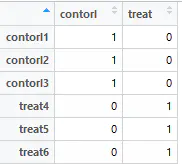
Preparing the design matrix:
					r
CopyEdit
rm(list = ls())  ## Clear the workspace
options(stringsAsFactors = FALSE)

# Load the processed data
load(file = "step2output.Rdata")
dim(exp)

library(limma)

# Create the design matrix
design <- model.matrix(~0 + factor(group_list))
colnames(design) = levels(factor(group_list))
rownames(design) = colnames(exp)
design  # View the generated design matrix
Preparing Input Data — Contrast Matrix
					r
CopyEdit
contrast.matrix <- makeContrasts(paste0(c("treat", "control"), collapse = "-"), levels = design)
contrast.matrix
Example output:
					markdown
CopyEdit
         Contrasts
Levels    treat-control
  control            -1
  treat               1
The contrast.matrix declares the comparison we want to perform: We aim to compare the treat group against the control group. Here, -1 for control and 1 for treat means we are testing the expression difference as treat vs. control (i.e., a ratio of treat/control in log2 space).
At this point, all three required matrices for differential expression analysis have been prepared:
Expression matrix (
exp)Design matrix (
design)Contrast matrix (
contrast.matrix)
We are now ready to perform differential expression analysis using the limma package!
4.2 Performing Differential Expression Analysis with limma
The process consists of only three main steps:
lmFiteBayestopTable
Step-by-step code:
					r
CopyEdit
# Step 1: Fit a linear model
fit <- lmFit(exp, design)

# Step 2: Apply the contrast matrix
fit2 <- contrasts.fit(fit, contrast.matrix)  ## This step is crucial
fit2 <- eBayes(fit2)  ## Bayesian shrinkage of variance (default: trend = FALSE)
# If needed, you can set trend = TRUE in eBayes()

# Step 3: Extract the differential expression results
tempOutput = topTable(fit2, coef = 1, n = Inf)
nrDEG = na.omit(tempOutput)

# Optional: Save the results
# write.csv(nrDEG, "limma_notrend_results.csv", quote = FALSE)

# View the top results
head(nrDEG)

# Save the R object
save(nrDEG, file = "DEGoutput.Rdata")
At this point, we have obtained the differential expression result matrix (nrDEG). The key columns to focus on are:
logFC (log2 fold change)
P value (statistical significance)
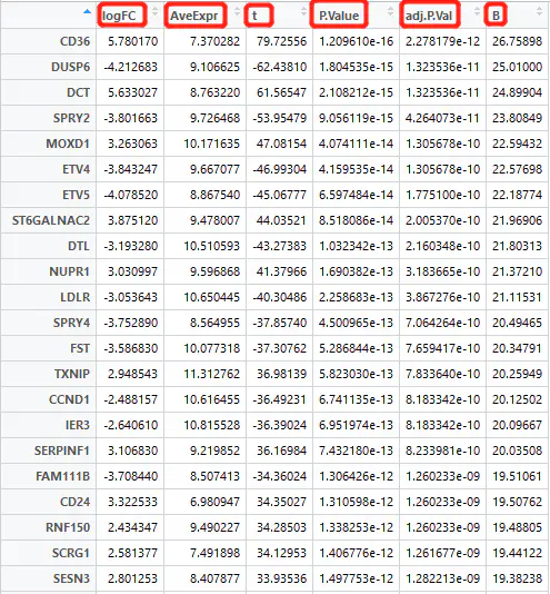
Differential expression analysis involves statistically testing each gene to evaluate:
the magnitude of change (logFC),
the average expression level,
and whether the p-value indicates statistical significance.
4.3 Visualization of Differentially Expressed Genes (DEGs)
After obtaining the differential expression matrix from the limma package, we should visualize the results to confirm whether the identified DEGs show clear separation between groups.
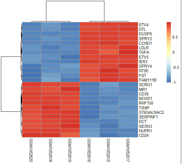
One common approach is to draw a heatmap.
Plotting a Heatmap
We will select the top 25 most significantly differentially expressed genes and plot a heatmap to inspect whether their expression patterns show clear group separation.
					r
CopyEdit
# Clear the workspace
rm(list = ls())
options(stringsAsFactors = FALSE)

# Load the results
load(file = "DEGoutput.Rdata")
load(file = "DEGinput.Rdata")  ## Assuming DEGinput.Rdata contains the expression matrix 'exp'

# Load required package
library(pheatmap)

# Select the top 25 genes based on significance
choose_gene = head(rownames(nrDEG), 25)

# Extract their expression matrix
choose_matrix = exp[choose_gene, ]

# Standardize the expression data by row
choose_matrix = t(scale(t(choose_matrix)))

# Draw the heatmap
pheatmap(choose_matrix)
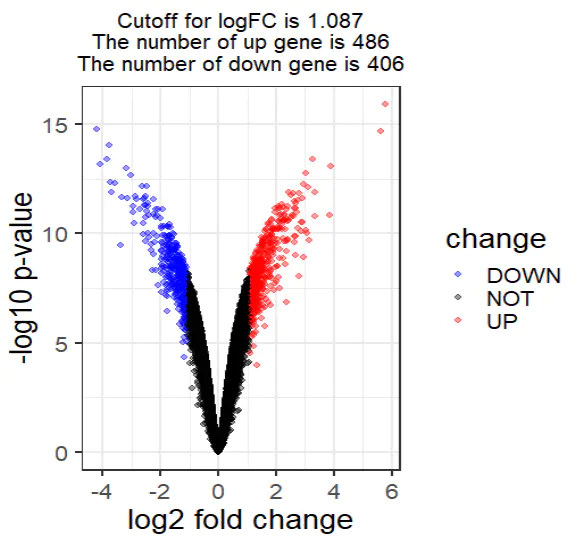
Volcano Plot
A volcano plot provides an intuitive visualization of both the magnitude of change (log fold change) and the statistical significance (p-value) of each gene.
Step-by-step code:
					r
CopyEdit
# Clear the workspace
rm(list = ls())
options(stringsAsFactors = FALSE)

# Load the differential expression results
load(file = "DEGoutput.Rdata")
colnames(nrDEG)

# Basic scatter plot (optional quick view)
plot(nrDEG$logFC, -log10(nrDEG$P.Value))
Enhancing the volcano plot with cutoffs:
					r
CopyEdit
DEG = nrDEG

# Define a logFC threshold dynamically based on the distribution
logFC_cutoff <- with(DEG, mean(abs(logFC)) + 2 * sd(abs(logFC)))

# Categorize genes as UP, DOWN, or NOT significant
DEG$change = as.factor(ifelse(DEG$P.Value < 0.05 & abs(DEG$logFC) > logFC_cutoff,
                               ifelse(DEG$logFC > logFC_cutoff, 'UP', 'DOWN'), 'NOT'))

# Create a title summarizing the cutoff and DEG counts
this_title <- paste0(
  'Cutoff for logFC is ', round(logFC_cutoff, 3),
  '\nThe number of upregulated genes is ', nrow(DEG[DEG$change == 'UP',]),
  '\nThe number of downregulated genes is ', nrow(DEG[DEG$change == 'DOWN',])
)
this_title

# Preview the updated DEG table
head(DEG)
5. Enrichment Analysis — KEGG and GO
Enrichment analysis is the process of annotating a gene list using established biological databases. After identifying a list of statistically significant genes through differential expression analysis, it is essential to perform functional annotation to understand their biological roles.
The most commonly used annotation databases are:
GO (Gene Ontology)
KEGG (Kyoto Encyclopedia of Genes and Genomes)
Other options include Reactome and MsigDB.
The most frequently applied statistical method for enrichment analysis is the hypergeometric test. In the context of pathway enrichment, the hypergeometric test essentially answers:
How many genes are there in the background (usually only those genes annotated in databases like KEGG)?
How many genes are in a particular pathway?
How many genes from your differential gene list overlap with a particular pathway?
The goal is to determine which pathways are significantly enriched in the differentially expressed genes, indicating biological processes that are potentially altered due to drug treatment or other experimental conditions.
5.1 KEGG Pathway Analysis
We use the clusterProfiler package to perform KEGG enrichment analysis.
Code for KEGG enrichment:
					r
CopyEdit
# Load the clusterProfiler package
library(clusterProfiler)

# Define gene lists
gene_up = deg[deg$change == 'up', 'ENTREZID']
gene_down = deg[deg$change == 'down', 'ENTREZID']
gene_diff = c(gene_up, gene_down)
gene_all = deg[, 'ENTREZID']

# Enrichment for upregulated genes
kk.up <- enrichKEGG(
  gene = gene_up,
  organism = 'hsa',  # Human
  universe = gene_all,
  pvalueCutoff = 0.9,
  qvalueCutoff = 0.9
)
head(kk.up)[, 1:6]
dim(kk.up)

# Enrichment for downregulated genes
kk.down <- enrichKEGG(
  gene = gene_down,
  organism = 'hsa',
  universe = gene_all,
  pvalueCutoff = 0.9,
  qvalueCutoff = 0.9
)
head(kk.down)[, 1:6]
dim(kk.down)

# Enrichment for all differentially expressed genes
kk.diff <- enrichKEGG(
  gene = gene_diff,
  organism = 'hsa',
  pvalueCutoff = 0.05
)
head(kk.diff)[, 1:6]
Extracting results for visualization:
					r
CopyEdit
# The enrichKEGG result is an S4 object; extract its data frame
kegg_diff_dt <- kk.diff@result

# Select significant pathways (p < 0.05) for upregulated and downregulated genes
library(dplyr)

down_kegg <- kk.down@result %>%
  filter(pvalue < 0.05) %>%
  mutate(group = -1)

up_kegg <- kk.up@result %>%
  filter(pvalue < 0.05) %>%
  mutate(group = 1)
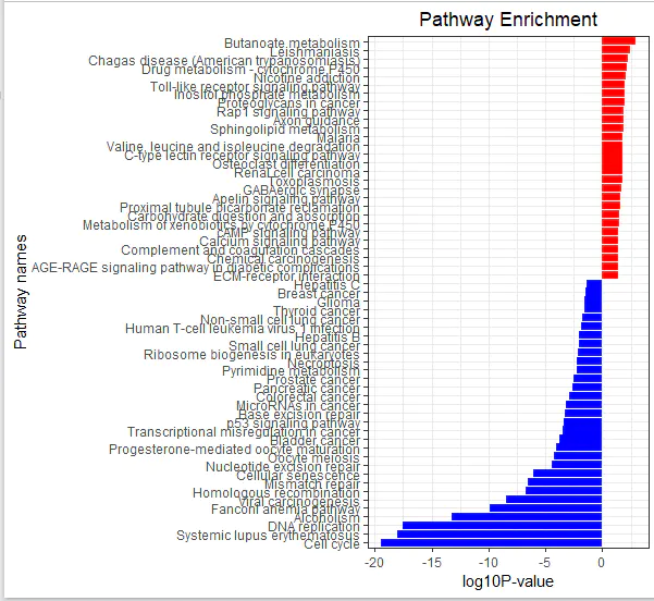
Custom function to visualize KEGG results:
					r
CopyEdit
library(ggplot2)

kegg_plot <- function(up_kegg, down_kegg) {
  dat = rbind(up_kegg, down_kegg)
  colnames(dat)

  # Convert p-values
  dat$pvalue = -log10(dat$pvalue)
  dat$pvalue = dat$pvalue * dat$group

  # Sort pathways
  dat = dat[order(dat$pvalue, decreasing = FALSE),]

  # Create barplot
  g_kegg <- ggplot(dat, aes(x = reorder(Description, order(pvalue, decreasing = FALSE)), y = pvalue, fill = group)) +
    geom_bar(stat = "identity") +
    scale_fill_gradient(low = "blue", high = "red", guide = FALSE) +
    scale_x_discrete(name = "Pathway names") +
    scale_y_continuous(name = "log10 P-value") +
    coord_flip() +
    theme_bw() +
    theme(plot.title = element_text(hjust = 0.5)) +
    ggtitle("Pathway Enrichment")

  return(g_kegg)
}

# Generate and save the KEGG enrichment plot
g_kegg <- kegg_plot(up_kegg, down_kegg)
g_kegg

ggsave(g_kegg, filename = 'kegg_up_down.png')